Ontario.ca web content editing guide
The web content editing guide helps content management system users create web pages with a consistent experience for those accessing ontario.ca.
About this guide
The web content editing guide is set up to help writers and web editors curate messaging and page layouts that are of a standard quality, easily recognized, accessible and consistent with the brand identity of ontario.ca, the Government of Ontario’s flagship website.
Ontario.ca style guide
How to write content for ontario.ca.
Ontario Design System
Create accessible and user-focused digital products and services consistent with the Ontario brand.
Working with HTML
Do not use a word processor such as Microsoft Word. Try Sublime Text or Notepad++ or a text editor of your choice. If you can’t install software on your work computer, try using a portable version of Sublime Text or portable Notepad++ which can run without being installed.
Most text editors can:
- save work-in-progress
- format and indent HTML and CSS
- autocorrect some errors
- colour code HTML for easier reading
Ontario.ca uses Drupal for content management and has a WYSIWYG code editor. However, we recommend that you write and edit HTML in a text editor first and then copy it to ontario.ca’s content management system.
Quality assurance
Manually check that the code and content have no errors and that links are working before publishing.
Check that you are using the correct tags and formatting by reviewing the design guide.
Learn more at Ontario.ca: checking your work and quality assurance (QA) (InsideOPS internal link).
Validator
Copy and paste your HTML into the W3C HTML validator. You can’t validate ontario.ca HTML by URL because the content is generated by JavaScript. Instead, use Validate by Direct Input
and select Validate
HTML
fragment.
Select the “Check” button.
On ontario.ca content, you will get errors or warnings if you use the <onesite> custom elements. Skip those and address the other problems.
HTML guidelines
Follow standard HTML styles and conventions for tidy and consistent code. For example:
- use lowercase tag names
- Do:
<p> - Do not:
<P>
- Do:
- use quotation marks around attributes
- Do:
<span lang="en"> - Do not:
<span lang=en>
- Do:
- include an end tag for all elements that are not listed below
- Do:
<p>This is a sentence.</p> - Do not:
<p>This is a sentence.
- Do:
Do not use certain HTML elements and attributes, and CSS classes listed with "do not use" in the following list.
HTML elements used on ontario.ca
aabbracronym— do not useasideb— do not useblockquotebrcaptioncitedddivdldtem— do not usefigcaptionfigureh1— do not useh2,h3,h4,h5,h6hriiframeimgliolonesite-datatableonesite-faxonesite-phoneonesite-refpqsmallspanstrongsubsuptabletbodytdtfootththeadtru— do not useul
HTML attributes
allowfullscreen— foriframeonlyalt— forimgonlybullet-colour— forol.fancyonlyclass— can use anywheredir— can use anywhereextension— foronesite-phoneonlyframeborder— foriframeonlyheaders— forth and tdonlyheight— forimgonlyhref— foraonlyhreflang— foraonlyicon— foronesite-phoneandonesite-faxonlyid— can use anywhere buth2label— foronesite-phoneandonesite-faxonlylang— can use anywherescope— forthonlysrc— forimgandiframeonlysummary— avoid; fortabletollfree— foronesite-phoneonlytty— foronesite-phoneonlytypewidth— forimgonly
Ontario.ca custom HTML
Ontario.ca has custom HTML elements and attributes. They are converted into valid HTML when displayed in a browser.
All of these elements begin with <onesite->. For example, <onesite-ref> for footnotes. Custom HTML elements generate errors when you validate HTML, but they can be used on ontario.ca.
CSS classes
alertbuttoncalloutcolumnscolumns-x-large,columns-large,columns-medium,columns-small,columns-x-smallendfancyfull-widthicon-nameimg-roundinline-listlargelarge-#leftlegal-listlegal-list-parenthesesmedium-#medium-up-left,medium-up-rightno-bulletno-stripesno-wrapnon-numericnot-legalnumericorg-chartparentheses,parentheses-rightredactedrightrowshow-for-srsmallsmall-#smallersecondarysummarytext-left,text-right,text-centerupperuppercasew-#
Abbreviations
Abbreviations are used to shorten lengthy terms. The <abbr> tag assures that the meanings of acronyms and abbreviations are clear to everyone. Use abbreviations sparingly.
Acronyms and initialisms are also considered abbreviations and are treated the same. The <acronym> tag is deprecated in HTML5.
Learn about abbreviations in the style guide.
ONTERM and Termium are great resources for many of the abbreviations used in the government.
Do and do not
Do
- use the
<abbr>tag alongside the full version for the first time the abbreviation is used on a page, without the title attribute - use
<abbr title=""></abbr>every time after the first time - use tags around whole words
- Do:
<abbr title="Chief Executive Officers">CEOs</abbr> - Do not:
<abbr title="Chief Executive Officers">CEO</abbr>s
- Do:
Do not
- use an abbreviation on a French page if there is no French equivalent (write out the full French word, even if the abbreviated version is used on the English page)
- introduce acronyms/abbreviations if you only use them one time (write out the full word)
- use
<abbr>tags for abbreviations that are now used as words or abbreviations that are well-known and spoken as written - use Title Case for the title attribute unless it is a proper noun
Accessibility
Screen readers do not recognize acronyms and abbreviations unless they are defined with markup. For example, a screen reader may say “The it manager” in the sentence “The IT manager has arrived,” instead of “The eye-tee manager.”
First time use
Use <abbr> alongside the full version for the first time, without the title attribute.
Subsequent use
After defining the abbreviation for the first time, use with the title attribute for every instance after.
Inside HTML tags
Abbreviations can be used as an inline element, meaning that it can be used within other codes.
Whole words
Always use the <abbr> tag around the whole word.
Plurals
When the abbreviation is a root word
Symbols
Use the appropriate character or HTML entities instead of abbreviations. Refer to the list of official list of character entities.
- if it’s a minus sign in an equation, use − or
− - if it’s an en dash, use – or
– - if it’s a multiplication, use × or
×
Common abbreviations
Find more commonly used abbreviations by the Ontario Government.
| English | French |
|---|---|
e.g. | p. ex. |
etc. | etc. |
vs. | c. |
et al. | et autres |
Inc. | Inc. |
Ltd. | Ltée. |
Other abbreviations
Related: Ontario Ministry acronyms
For acronyms or abbreviations with gendered terms or adjectives in French, please check with your translator on which form (masculine or feminine) to use for the title attribute (full form).
| English | French |
|---|---|
GO Transit | GO Transit |
HTML | HTML |
ISSN | ISSN |
I&IT | ITI |
2SLGBTQIA+ | 2ELGBTQIA+ |
LGBTQ+ | LGBTQ+ |
ONTERM | ONTERM |
OSAP | RAFEO |
| |
Units
Units are written without periods and are the same form for both singular and plural. Refer to numbers.
| English | French |
|---|---|
kg | kg |
cm | cm |
km2 | km2 |
cm3 | cm3 |
°C | °C |
Legal terms
Laws, acts, regulations and the names of other documents, such as the Budget or Fall Economic Statement, must use the <cite> tag. Do not use the <i> or <em> tag. Refer to italics.
Related: Titles of Ontario Public Service Corporate Directives, Operating Policies and Guidelines
Roman numerals
Do not use roman numerals unless they are legally required or used to refer to parts of other web pages or documents. Add abbreviation tags to roman numerals. Refer to numbers and roman-numeral ordered list.
When not to abbreviate words
Words that were previously abbreviations or acronyms that have been used so much that they become words themselves do not need to be abbreviated.
- fax
- scuba
- laser
- radar
- gym
- phone
- photo
Abbreviations that are well-known and spoken as written.
- i.e.
- RSVP
- ASAP
- a.m.
- p.m.
Charts, graphs and infographics
Charts and graphs
Charts are used to present data visually. Use a chart when the comparisons between values and data trends are more important to the user than the individual numeric values.
Do and do not
Do
- add a caption that describes the value comparisons and trends or add a table of the data below the chart
- use text and colours that have enough contrast
- use at least 12pt font for chart and graph labels
- label the axes of a chart or graph
- check that charts are readable in mobile devices (or resize your browser)
Do not
- use an image of a chart or graph if it can be built using HTML and CSS (learn more at infographics)
- use images of tables — build a table instead
- use text that has been rotated to display vertically instead of horizontally (it’s hard to read)
Accessibility
Accessible HTML graphs do not require alt text. If your graph is an image, write a detailed caption that conveys the same information a sighted user would have.
Alternative text isn’t sufficient for complex charts. Every browser has a limit to how many characters of alt text it will display. Avoid alt text longer than 125 characters as it may get cut off. Use figure captions to display longer text.
Use different line styles and weights, different shades of light and dark or different textures, in addition to colour, to differentiate data series and improve accessibility for colour blind users. Charts and graphs should be understandable if printed in black and white.
Learn more at Complex Graphics and Long Text Descriptions (InsideOPS internal link).
Organizational charts
Images of organizational charts are not accessible, they create barriers for those using a screen reader. They are also hard to read for those that have low vision or are using a mobile device.
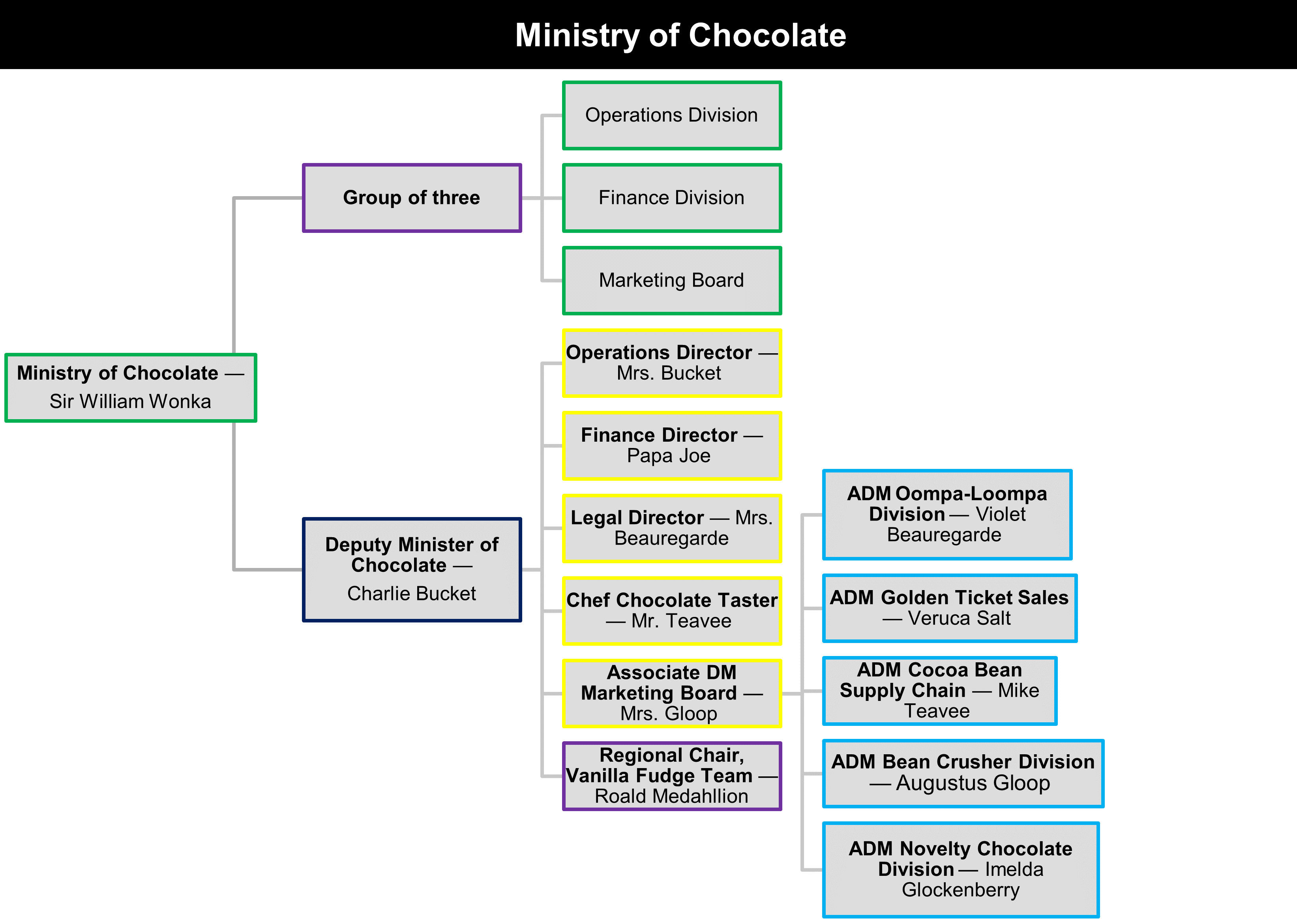
Instead of using an image, create a simple unordered list with the class .org-chart and include nested sub-lists to show the hierarchy of your organization. Wrap each list item with a <div></div> tag to apply the styling. Link to the original image as a "printer friendly" version.
Below is a version of organizational chart for the fictional Ministry of Chocolate. The chart shows the following hierarchical structure with the top level assigned to the Minister of Chocolate.
Bar graph
Construct bar graphs row by row. Each bar can have a maximum width of 100%.
If you wanted to display the following data:
- 2,000
- 3,500
- 560
Use the highest value (3,500) as your 100% and calculate the other values from that. An online percentage calculator can help. To change the size of each bar, adjust the span class="amount w-##" to the appropriate percentage.
Your bar chart row values will be:
w-57w-100w-16
You will put the actual values inside the span class="number"
The following example aligns the description to the right of the graph.
Stacked bar graph
Adding another span class="amount w-##" will stack another bar on top of a bar.
The following example is a stacked bar graph with descriptions aligned to the left.
Infographics
An infographic combines information and graphics to present content in a visually interesting way. They combine text with images and sometimes charts or graphs — often in one large graphic.
The purpose of an infographic is important when deciding how to present it online. Infographics may be used for marketing as “shareables,” which are suitable for posting on social media.
If the infographic is intended to supplement the web content, it must be created as accessible mobile-friendly HTML and CSS. These are time consuming to make and must be supported by a government or marketing priority and approved by the Cabinet Office Digital if they will be posted on ontario.ca.
Do and do not
Do
- distribute shareables through social channels only
- link to printable infographics using the text “Download printer-friendly <title of document> (PDF)” instead of embedding them on the page
- describe printable infographics using a text alternative of the information contained in the infographic
Do not
- insert full size infographics onto a page — they are not accessible or mobile friendly
Contact information
Do and do not
Do
- use contact icons only on landing pages and place the icons before the phone and fax numbers, email address, social media accounts, and website addresses
Do not
- use icons if the contact information spans more than one line with the icon
- link to non-government social media accounts
Phone and fax numbers
On ontario.ca, use our custom HTML element for these numbers. Use the same code for French, and it will appear correctly when viewed on French pages.
The formatting you use will be ignored and replaced with standard formatting automatically. You can include letters in the number; it will show in both letter and number form. Use the extension attribute for extensions.
Phone numbers
Fax numbers
Multiple numbers
Icon and labels
Email addresses
If there is a single email address to contact for everything on a page, do not include the address on the page. Instead, use the contact link in the footer.
Addresses
Avoid abbreviations.
Highlight organization name
The heading level will need to be adjusted to fit your context.
Websites
Related: linking
Social media
Do and do not
Do
- link to official government social media accounts that are actively maintained (for example, a ministry’s account, a government marketing campaign, etc.)
- place social media links before other contact information
Do not
- link to more than one social media account of the same type per service (for example, do not link to two different Twitter/X accounts)
Combining contact information
Hours of operation
Include all days of the week. You may group days that have the same hours if they are consecutive.
Content highlighting
Asides and callouts
Do and do not
Do
- keep text brief and aim for a maximum of 280 characters
- minimize the use of callouts and asides — avoid having multiple per page if possible
Do not
- use asides to change the background colour of text — they have a semantic meaning
- use asides to highlight important content (refer to page alerts)
- put an entire block of content (rather than a short excerpt) in a callout or aside
Asides
Asides should include content that is not directly related to surrounding content on the page. Content in an aside could be considered separate from the rest of the page content. Asides are coded differently from callouts so they do not interrupt the flow of content for screen readers.
You can use asides when the content:
- can be skipped over without affecting the natural flow of the rest of the content
- is policy-related or niche information for stakeholder audiences
Use blockquotes if the content is quoted from another source and is still part of the main content.
Adjust the heading level to fit your content. If you’re unsure about which heading level to use, discuss with your content designer or use <div class="aside__title"> for the heading.
Callouts
A callout is used to emphasize an important snippet of information within the flow of a page. Content in a callout should be something on the page that you want to highlight, but that is not critical information.
Use blockquotes for quoted content or asides for content that is less important than the main content or task and do not need to be highlighted.
You can use a callout:
- to highlight interactive content such as a form, a search field or a calculator
- in the related links sidebar or in the body
- within infographics
Adjust the heading level to fit your content. If you’re unsure about which heading level to use, discuss with your content designer or use <div class="callout__title"> for the heading.
Page alerts
Page alerts contain time-sensitive pieces of information and typically appear at the top of a page to capture the user’s attention.
Use page alerts to:
- highlight content that notifies users about service interruptions and changes
- bring attention to safety warnings
- communicate the result of a user action (for example, error or success)
Do and do not
Do
- try to limit to one alert per page — users will start ignoring them if overused
- write concise headings and copy totalling a max of 280 characters
- include a heading that clearly convey the purpose of the alert (for example, “Warning”)
- adjust the heading level to fit your content. If you’re unsure about which heading level to use, discuss with your content designer or use
<div class="alert__header-title">for the heading.
Do not
- use page alerts just for styling regular content (for emphasis or highlighting)
- include alerts that are not related to the user’s current goal
- blame the user when writing error messages (instead of “You entered an invalid postal code”, try “Please enter numbers and letters only”)
Archive labels
Archive labels are used when a page no longer has a user need. Archived content should link to the current version of a document if it exists.
Archived pages will remain on ontario.ca for a limited time. You can search for unpublished pages and past versions of published pages through the Archives of Ontario.
On ontario.ca, ministry web contributors can use the Archive and other labels
tab to automatically show an archive label.
Button links
Do and do not
Do
- ensure button text is clear, descriptive and action-oriented (for example, “Apply for OSAP” or “Download your receipt”)
- use sentence case (capitalize only the first letter of the first word)
- use a maximum of 25 characters including spaces
Do not
- change button colours
- underline text for primary or secondary buttons
- use multiple primary and secondary buttons unless absolutely necessary
You can use buttons to help the user carry out an important action such as downloading a PDF. Use a specific call-to-action rather than a generic one. For example: “Complete our survey” instead of “Share your feedback”.
Images, maps and videos
Images
Do and do not
Do
- use images to illustrate concrete things (for example, animals, I.D. cards, licence plate sticker), not abstract concepts (for example, light, holistic, synergy)
- use branding from the Ontario Visual Identity (approved logos and marketing campaign graphics) and approved Ontario brands (for example, ServiceOntario)
- use images to illustrate the hierarchy of content by using tall banners on entry pages (home pages, the landing page for a marketing campaign), narrow banners on top-level topic landing pages and no banners on sub-topic or article pages
- optimize images for the web to reduce the file size as much as possible while maintaining a reasonable quality (read Compressing image files in the design system)
Do not
- put text on images
- use images of text except for logos where preservation of the font face is critical, or for maps and charts — images of text create barriers for mobile device users and people with low vision
- use photographs to set the mood or decorate a page
- develop a new brand for a program or page — use the Ontario Visual Identity instead
- heavily-distort or edit images associated with the Ontario Visual Identity
- use images that are unrelated to the page’s subject matter
- use images that are too small to show important details, especially if viewed on mobile devices
Alt text and image accessibility
Images can make content easier to understand for those with cognitive and learning disabilities. It also serves as a visual cue for those with low vision. Inaccessible images can be a barrier to some people.
Consider inclusion and diversity when selecting photographs. Think about what age, gender, race, culture, religion, sexual orientation, abilities, family structure, income and location you are representing with your choices. Learn more about photography usage in the design system.
Images must have text alternatives (alt text) that describe the content of the image, unless purely decorative. In addition to alt text, check how your images appear to colour-blind users and in black and white.
Learn more at Complex Graphics and Long Text Descriptions (InsideOPS internal link).
When to add alt text
Alt text provides a text alternative to images, photography and other non-text content.
If an image is decorative and provides no added information, the alt attribute should be blank. One way to determine if an image is decorative is to write the alt text, and then see if the alt text adds any extra value for the user.
Examples of alt text:
- alt text that adds value:
the Minister of Health shakes hands with a conference attendee
- alt text that adds no value: “blue square” (the image is decorative)
Visit WebAIM for more examples.
When writing alt text
Do
- be accurate when describing the image
- write what’s needed to cover the information and meaning that the image provides
- describe the function, content and context of the image
- include details that are important to the page’s narrative and subject matter
- keep it short — a short sentence is often enough, but if needed, keep it to a maximum of two sentences
- limit the text to 125 characters as every browser has a different alt text character length limit (this also accounts for the fact that the French translation will typically be longer than the English)
- add a caption to your image if you cannot describe the image sufficiently with just alt text
Do not
- repeat information in the alt text if there’s content around the image that already offers the same information — this is redundant and adds informational “clutter” for assistive technology users
- use phrases like “image of …” or “graphic of …” — users will already know they are focused on an image element
Banners
Use a banner to add visual interest to the landing page for:
- your ministry
- a paid marketing campaign
- a key high-profile government initiative
Images must be:
- exactly 760×560px
- no more than 1 MB
- a PNG, JPG or JPEG
Do and do not
Do
- choose a single image (versus a multi-image panel) that represents an aspect, idea or interpretation of the page topic
- use an image that is impactful and focused
- ensure that the title and lead area that overlays the banner will not cover the primary subject matter, such as people’s faces.
- credit banner images if required by using a
<small>tag in the summary or at the bottom of the page.
Do not
- add borders around banners — banners span the full width of the users screen
Thumbnails
Thumbnails are placed to the right of the title and lead of article pages. Thumbnails must be:
- a minimum width of 352px
- no more than 50 kb
- a PNG, JPG or JPEG
Try to match thumbnail images to the height of the lead. For example, on desktop, a page lead with:
- 1 to 2 lines, use a 16:9 image ratio or a 352×198px image
- 3 to 5 lines, use a 4:3 image ratio or a 352×264px image
- 6 lines or more, use a 1:1 image ratio or a 352×352px image
Include clear space inside the image boundary for official wordmarks and logos — otherwise the logo will stretch to the edge of the boundary.
Page body
Do and do not
Do
- use JPEG format for photographs
- use PNG for non-photographic images (icons, drawings)
- embed images that fit the page width
- use multiple images targeted for various screen sizes, if necessary
Do not
- embed images larger than 900px wide such as maps — instead, link to the image
- use images that aren’t recognizable when viewed on small screens
Maps
Maps, even if they are images, should be brought to Cabinet Office Digital for approval because there are special accessibility and mobile considerations. We may recommend a map be presented in these formats:
- ArcGIS or ArcGIS Online map
- Text description and accessible PDF
All images of maps must have descriptive text that clearly describes the content, including:
- the data coordinates or addresses in a table below the map
- a description of what the map shows
- a description of any key boundaries
The size of the map embedded on the page cannot be wider than the body content area. You may link to a full-sized PDF version for print purposes.
Map accessibility
The descriptive text must be visible to all users and located above or below the map (or linked to from above or below the map).
Accessibility is inclusive of many assistive technologies and techniques used by people with disabilities, including screen readers, screen magnifiers, browser text contrast increases, zooming and more. Anyone with poor vision and/or colour blindness could benefit from a text description of a graphic.
Alt text is not sufficient for a map for two reasons:
- Every browser has a different alt text character length limit. We recommend up to 125 characters in alt text. This accounts for the fact that the French translation will typically be about 1/3 longer than the English. 125 characters is usually not sufficient to describe a map.
- Alt text is not always used by people with poor vision and colour blindness.
When linking to a larger version of the map, use a high-resolution PDF with vector shapes and text instead of a high-resolution image, because the PDF can be printed at a higher quality.
Videos
Videos can be useful to convey instructions or information to users, but can also be a barrier to some users if they aren’t made accessible.
Do and do not
Do
- use videos only if the content is easier to understand with moving images
- caption videos
- include both a transcript and audio description
Accessibility
Captions
Videos with audio require captions that are synchronized with the audio track. Everything said in the video must be included in the captions. It must also include names, sounds and descriptions.
There are two types of captions: open and closed. Open caption means that the caption is embedded into the video itself, and cannot be turned off. Closed captioning means that the caption can be turned on and off.
Audio description
Audio descriptions speak out what is happening in the video so that it’s accessible to people with low vision. There are two ways to create audio descriptions:
- a narrator describes all the visual information
- add a separate audio track that describes the visual information, where possible
Vertical videos
- Use class
flex-video--shortson videos that are vertical or 9:16. - Applying a grid will help determine what size it needs to be at in varying screen sizes.
Languages
Use the lang attribute to declare changes in language on a page. This includes English text on French pages and vice versa.
Do and do not
Do
- declare the primary page language of each page
- use lowercase ISO 639-1 codes for the
langattribute unless one doesn’t exist (use the ISO 639-2 codes instead) - use
lang="XX"in a<span>,<div>or<p>element that contains text written in another language
French characters
| Name | Lowercase | Uppercase |
|---|---|---|
| a circumflex | â | Â |
| a grave | à | À |
| a acute | á | Á |
| c cedilla | ç | Ç |
| e acute | é | É |
| e circumflex | ê | Ê |
| e diaeresis | ë | Ë |
| e grave | è | È |
| Name | Lowercase | Uppercase |
|---|---|---|
| i circumflex | î | Î |
| i diaeresis | ï | Ï |
| o circumflex | ô | Ô |
| u circumflex | û | Û |
| u diaeresis | ü | Ü |
| u grave | ù | Ù |
| y diaeresis | ÿ | Ÿ |
English links on a French page
If there is no French version of the page, set the lang and the hreflang attributes since the text of the link is also in English.
Non-breaking spaces
A non-breaking space (in HTML as ) prevents text from wrapping to a new line at that point. It is important to include non-breaking spaces rather than regular spaces in certain specific circumstances in French.
Quotation marks
These need non-breaking spaces after the opening mark and before the closing mark.
Colons
These should be preceded by a non-breaking space.
Dashes
Any dash (hyphen, en dash or em dash) that is preceded by a space should be using a non-breaking space.
Numbers, dates and times
The space after any digit (or fraction character) should be a non-breaking space, unless it is a year.
If a month or season (or “de”) and a year are separated by only a space, that space should be a non-breaking space.
The “h” used to separate hours and minutes should also be followed by a non-breaking space.
Other circumstances
There may be other circumstances in which non-breaking spaces should be used rather than regular ones to maintain readability. Read the text and think to yourself, “Would it be odd if the line of text wrapped at this spot?”.
Non-breaking spaces tool
Link to multilingual versions of content
Use the name of the page or document in the language the content is in, followed by the language in English in brackets. This makes content accessible to two audiences:
- people with a lower understanding of English
- English speakers looking for alternative language content for other people (for example, children of elderly parents and health care workers)
Most common languages in Ontario
| Language | Code | Right-to-left? | Autoglottonym |
|---|---|---|---|
| English | en | No | English |
| French | fr | No | Français |
| Mandarin | zh | No | 國語 |
| Cantonese | yue | No | 廣東話 |
| Punjabi | pa | No | ਪੰਜਾਬੀ |
| Spanish | es | No | Español |
| Arabic | ar | Yes | عربي |
| Italian | it | No | Italiano |
| Urdu | ur | Yes | اردو |
| Filipino (Tagalog) | tl | No | Tagalog |
| Portuguese | pt | No | Português |
| Tamil | ta | No | தமிழ |
| Polish | pl | No | Polski |
| Russian | ru | No | Русский |
| Farsi (Persian) | fa | Yes | فارسی |
| Gujarati | gu | No | ગુજરાતી |
| German | de | No | Deutsch |
| Hindi | hi | No | हिन्दी |
| Vietnamese | vi | No | Tiếng Việt |
| Korean | ko | No | 한국어 |
First nations languages
None of these are written right-to-left.
| Language | Code | Autoglottonym |
|---|---|---|
| Ojibway | oj (ISO 639‑1) | ᐊᓂᔑᓈᐯᒧᐎᓐ |
| Cree | cr (ISO 639‑1) | ᓀᐦᐃᔭᐍᐏᐣ |
| Oji-cree | ojs (ISO 639‑3) | ᐊᓂᔑᓂᓂᒧᐏᐣ |
| Inuktitut | iu (ISO 639‑1) | ᐃᓄᒃᑎᑐᑦ |
| Mohawk | moh (ISO 639‑3) | Kanien’kéha |
| Swampy Cree | csw (ISO 639‑3) | ᓀᐦᐃᓇᐍᐏᐣ |
| Ottawa (Odawa) | ctw (ISO 639‑3) | N/A |
| Mi'kmaq | mic (ISO 639‑3) | Míkmawísimk |
Chinese languages
Cantonese and Mandarin are listed in the above table, as they are spoken languages. For writing systems, use this table:
| Language | Code | Autoglottonym |
|---|---|---|
| Chinese (Traditional) | zh-TW | 中文 (繁體) |
| Chinese (Simplified) | zh-CN | 中文 (简体) |
Layout
Alignment and wrapping
Use the .no-wrap class to prevent text from being split across multiple lines. Changing how text wraps can have a significant impact on the layout on mobile devices. Learn how wrapping is used with French copy.
Do and do not
Do
- use
.no-wrapsparingly, for 5 words or 20 digits or less - use centre and right alignment if necessary when building infographics and visualizations
Do not
- use the
.no-wrapclass or for phone numbers, use phone number markup instead - use centre and right alignment for paragraphs and lists of content
To prevent some text from being split across multiple lines, use the .no-wrap class.
You can also replace a space with a non-breaking space to prevent wrapping at that position.
Margin and padding
Refer to the full description of margin and padding classes to help modify spacing within your layout.
Please note that all spacing classes have been modified for the ontario.ca theme. The Ontario Design System’s use of namespace ontario- has been removed from each class name for ontario.ca. For example:
ontario-margin-top-0-!has been changed tomargin-top-0-!ontario-padding-top-0-!has been changed topadding-top-0-!
Grids
Ontario.ca uses a modified version of Foundation’s grid system — a 12-column, nest-able grid. Start by adding a <div> element with a class of .row. This will create a horizontal block to contain vertical columns. Then add <div>s with a .column class within that row. Specify the widths of each column with the .small-#, .medium-#, and .large-# classes. All columns must add up to 12 or the last column must use class .end.
The Foundation grid is mobile-first. Code for small screens first, and larger devices will inherit those styles. Customize for larger screens as necessary.
If you use columns anywhere on an ontario.ca page, make sure all content in the body field is laid out in columns, otherwise the text will not align. Text inside columns will indent because of padding. Use a row with .small-12 .columns for any content that is not part of the multi-column layout.
Learn more about grid column options in the design system.
Source ordering
Using these source ordering classes, you can shift columns around between our breakpoints.
Block grid
Block grids are a shorthand way to create equally-sized columns. Add a class of the format .[size]-up-[n] to change the number of columns within the row. By default, the max number of columns you can use with block grid are 8.
Smarties
The Smartie design element uses the block grid with the additional HTML for captions, font styles and background colours. Use Smarties to display numbers and statistics, capturing the high level statistics of the content.
Do and do not
Do
- limit the number of Smarties that can be used per page to a maximum of two sets, with three smarties per set
- use
abbrtags where necessary. Refer to abbreviations.
Do not
- have more than one line of content within a Smartie; if a preposition is needed, choose to use “+” to represent “over”, “~” to represent “approximately”, etc.
- use icons within a Smartie
- override the default font size
Colour options
We currently have 6 options for smartie colours:
red-bgorange-bggreen-bgblue-bgpurple-bgmagenta-bg
Blue is the default smartie colour.
Horizontal rules
Use a horizontal line (<hr aria-hidden="true">) to separate discrete chunks of content.
On ontario.ca, top borders are added to <h2>s on article pages automatically.
Indenting
Legal text
Laws, acts, regulations and the names of other documents, such as the Budget or Fall Economic Statement
Redacted text
Include a message in an alert box at the top of the page or section.
Legal list
Links
Links lead users to a different page or more information on the same page. They are always underlined, except within navigation and lists of links. Learn more about writing descriptive links in the style guide.
Do and do not
Do
- use meaningful and concise text for links
- describe the target of the link with unique wording
- use relative links for content on the same domain (ontario.ca)
- ServiceOntario
<a href="/page/serviceontario">
- ServiceOntario
- use absolute links for content on other domains
- Destination Ontario
<a href="https://www.destinationontario.com">
- Destination Ontario
- add
https://to the beginning of absolute hyperlinks- instead of
<a href="www.destinationontario.com">use<a href="https://www.destinationontario.com">
- instead of
Do not
- use URLs as link text
- instead of
Visit www.ontario.ca/osap for more details
, useVisit
OSAP
for more details
(and do not forget to include an abbreviation tag!)
- instead of
- use repeated phrases like “Click here” or “More information.” It makes it difficult for users to scan the page.
Accessibility
Users should be able to:
- use the tab key to navigate between links
- follow a link by pressing the “Enter” key
Alert users when opening new windows by including a notice within the link text.
Anchor links
To link to another section on the same page or a specific place on a different page, use the id attribute as your anchor.
Do and do not
Do
- add a descriptive
idto the closest element to create a new anchor - use an existing
id— for example, the second level 2 heading of a page always will be#section-1as level 2 headings haveidautomatically assigned once published, starting from#section-0
Do not
- use empty
<a>tags for anchors such as<a id="january" name="january"></a> - add
idattribute to level 2 headings, use<span>or another existing element instead - repeat
idattributes on the same page as eachidmust be unique
id and anchor links
id attribute values must:
- begin with a letter
- contain only non-accented letters, numbers, hyphens or underscores
Email addresses and phone numbers
Refer to contact information.
Opening new windows
Generally, do not use "target="_blank" to open links in a new window. Only use this on pages with forms where user data would be lost by opening a link in the same window.
Other languages
Learn about linking to content in other languages.
Linking to non-HTML content
If you wish to publish content in a format other than HTML on ontario.ca, please contact Cabinet Office Digital.
List of links
Refer to lists of links and list of links displayed in a single line.
Prominent links and calls to action
If there is one or several links on a page that need to stand out, you can style them to look like a button.
Broken links
It is important to review every link on a page regularly to ensure that it is still works. Broken links limit access to information and can make our user lose trust in our content.
Related content
When linking to related content on a full-width landing page, place the links at the end of your content in the body, instead of the Links sidebar.
Lists
Lists are a great way to organize related information. Lists add structure to your content, making it more accessible and easier to understand.
Unordered lists
Use unordered lists to group related items that do not have a specific order. Learn more about bulleted lists in the style guide.
Links
Nested lists
Additional <ul>s can only be nested within <li>s.
Hide bullets
Note that the list will not be indented.
Horizontal list
Horizontal link list
Ordered lists
Use ordered lists to group related items that have a specific order. Learn more about numbered lists in the style guide.
Nested list
Alphabetical list
Roman numerals list
Interrupted list
List with parentheses
Multi-column lists
For long lists with short items, you can have the list display in columns. Use the class columns-x-large to get very wide columns, or columns-large, columns-medium, columns-small, and columns-x-small for narrower columns. They will automatically adjust for the screen size.
Definition lists
Use definition lists to associate terms with their meaning or a description.
Numbers
Learn more about numbers in the style guide.
General numbers
Use a comma (non-breaking space in French) in numbers with four digits or more, except for years, addresses, and currency.
Use “%” (percentage symbol) to show percentages. Do not spell out “per cent” unless it follows a spelled-out number at the beginning of a sentence.
Number ranges
Use an en dash, not the hyphen-minus character on your keyboard.
Ordinal numbers
Use superscript when not writing ordinal numbers in full.
Roman numerals
Do not use roman numerals unless they are legally required or used to refer to parts of other web pages or documents. Add abbreviation tags to roman numerals. Refer to abbreviations and roman-numeral ordered list.
Fractions
For common fractions such as ½, use fraction characters.
Do not include a space between numbers when using fractions.
Do not use “th” after fractions expressed in numerals
Do hyphenate ages if they contain fractions.
Ages
The above example uses non-breaking hyphens.
Money
Money should have either two decimal places (i.e. cents) or be rounded to the nearest dollar (or thousand, million, or billion dollars). Learn more about money in the style guide.
Dates and times
Learn more about dates and times in the style guide.
Related: hours of operation.
Quotes and references
Quotes
Quotations can be from people or other sources, for example, web pages and other documents. Do not use quotation marks. Use <q> for short quotes within a sentence and <blockquote> for one paragraph or longer quotes.
Blockquotes
Blockquotes are used to indicate that a piece of content is a quotation from a source or speaker. This often includes a cite attribute for the URL of the quote’s source or the speaker’s name, to provide context.
You do not have to include quotation marks in the copy of your blockquote, because the blockquote style will add them for you.
Quotation marks
Use quotation marks if not using the <q> or <blockquote> elements, for example, when referring to a word. Use curly quotation marks instead of straight quotation marks. The HTML entities are “ for the opening quotation mark and ” for the closing quotation mark.
Footnotes
Footnotes should only be used when there is a legal reason for the website to match a print publication with footnotes. If the information is very important, add it into the body text where it makes sense rather than using a footnote.
The footnote feature uses custom HTML for ontario.ca and will not work anywhere else. The footnote text will become a link to the “Footnotes” section created automatically at the bottom of the page.
Do
- include
<onesite-ref number="#">Footnote text</onesite-ref>where you want the footnote reference to appear - use numbers, letters or roman numerals in the
numberattribute - within a single page, to reuse a footnote, repeat the
numberwhile omitting the footnote text, for example<onesite-ref number="#"></onesite-ref> - use continuous numbering for the footnotes throughout the pages of a book, since they can be joined when printing
Do not
- add a space before the tag
- repeat the footnote text in the page body
- restart numbering on each page in a book
Tables
Use tables to present data in a grid or matrix that makes it easy to compare or contrast values.
Do and do not
Do
- use tables for tabular information and to quickly contrast detailed data and precise values
- describe the content of your table in a heading above it or using a caption (refer to caption vs. summary)
- format dates within tables using ISO 8601 format: YYYY-MM-DD
- use abbreviated months (such as Jan, Feb, Mar) in tables only, if needed to save space
- mark up header cells with
<th>and data cells with<td>(refer to table structure) - mark up abbreviations and acronyms used in tables
- include units of measurement in the column headers ($, cm, kg, etc.)
- use sentence case for table headings
Do not
- use tables for layout
- use tables if you only have a few rows or few columns — use a list instead
- leave cells in a table header empty
- leave data cells empty — use “N/A” (for “not applicable” or “not available”; wrapped in an
<abbr>tag withtitle="not applicable"or"not available"), “null” or “0” - create complex tables where cells span multiple rows or multiple columns
- include headers within a table — use multiple tables instead
- repeat units of measurement in individual data cells
Table structure
Every table:
- begins and ends with a
<table>tag - has a header
<thead>, which contains only the header cell information of the table, not the data. The header contains:- one row
<tr></tr> - header cells (visually bolding the text)
<th></th>
- one row
- has a body
<tbody>, that contains the data within:- rows
<tr></tr>
- rows
Accessibility
With the proper HTML markup, visually impaired users can navigate and read out your data one cell at a time by using their keyboard and the use of an assistive technology, such as a screen reader.
Describe tables with either a heading, brief descriptive text before or after the table that detail the table’s contents, or with a <caption>.
Do not use complex tables that require both header and id attributes for accessibility. Instead, use multiple tables with the scope attribute to make the table accessible to screen readers.
Using the scope attribute
For simple tables that have only the row header or column header, use the <th> elements without scope.
Otherwise, all <th> elements should have the scope attribute, which allows screen readers to detect column headers and row headers. The scope attribute tells the browser and screen reader that column cells with the scope="col" are column headers and row cells with scope="row" are row headers. When navigating through the table, screen readers read out one cell at a time and reference the associated header cells.
Caption vs. Summary
Captions help readers understand the context of the table. Captions can be the table’s title and/or description.
Summaries helps readers understand the structure and organization of the table. The summary attribute is used with complex tables to convey information about what content can be found in which column or row. Tables of this complexity should be avoided and few screen readers read out the summary attribute. Instead, break them up into simpler tables.
Examples
Table with a caption
Add the <caption> tag immediately after the <table> tag.
Table with row and column headers
All <th> elements use the scope attribute. Column headers use scope="col". Row headers use scope="row".
Table with column headers
Use the <th> elements without scope.
Table without zebra striping
By default, tables are styled with alternating white and light coloured backgrounds for each row. This helps users to better differentiate the values of one row from another. If you wish to turn it off, use the .no-stripes class on the <table> element.
Numbers and summary / total rows
If your table has one or more columns of numbers, use the .numeric class. It aligns the numbers, making them easier to compare.
Remember to add the .non-numeric class to all <td>s in non-numeric columns (and <th>s in the <thead>) to remove number formatting.
Subtotal and total rows
Make tables accessible by creating multiple tables instead of combining multiple subtotal and totals in one table. This avoids complex header and id markup and ensures the table is accessible to the widest possible audience.
Multiple tables
Break complex tables into multiple simple tables.
Multiple tables on the same page with the same headers should have consistent widths. Use the .full-width class on the <table> and the w-# class on <th>s, where # is a percentage of the overall table width.
Wide tables
Use .full-width to make the table as wide as the page. A table causes horizontal scrollbars to appear on small screens because it is wider than the content area.
Long tables (interactive tables)
For tables with more than 20 rows, adding a sort and/or search function can benefit users if they are looking for specific information.
On ontario.ca, we have a content type specifically for long tables, called an interactive table.
To make an interactive table, send a UTF-8 encoded CSV or or JSON file to your Open Data lead to upload to the Ontario Data Catalogue. The first row must have the column headers and cannot have the name "id" or contain any HTML. Following rows must contain the data for each column. Treat content in interactive tables like regular content on the page and use HTML as needed (<abbr>, <cite>, etc.)
Ontario’s Open Data Directive requires all government data, including data used in interactive tables, to be listed in Ontario’s Data Catalogue as open data unless exempt for legal, privacy, security, confidentiality or commercially-sensitive reasons. Learn more in the Open Data Guidebook.
Learn more at Ontario.ca: Interactive tables (InsideOPS internal link).
Example
Typography
All-caps
All caps are considered the written equivalent of “shouting” at a user.
Do and do not
Do
- write the text in proper case or lowercase and use the
.uppercaseclass to have it display as all-caps.
Do not
- use all-caps text unless it is part of a brand/program name (like Presto), it is legally required or it is an abbreviation
Accessibility
All-caps reduces readability for all users. Some screen reader software will read all-caps text letter-by-letter.
Bold and italics
Learn how to add emphasis in the style guide.
Do and do not
Do
- use
<cite>for laws, acts, regulations, media such as a books, films, etc., and documents such as Budget or Fall Economic Statement - use
<strong>to make text bold - use
<i>for the genus of organisms and scientific names of species - use sparingly: bolding everything is the same as bolding nothing
- highlight a whole paragraph or section with a callout instead of
<strong>tags - highlight multiple words or phrases you are describing with a definition list
Do not
- use
<i>except for for the genus of organisms and scientific names of species - use
<em>or<u> - use
<b>or bolding - use
<strong>for titles, instead use headings - use italics or all-caps when the text is bolded
Accessibility
<b> is a style tag — it bolds text only visually. Screen readers do not parse it, making the emphasis inaccessible.
<strong> is a semantic tag — it bolds text visually and flags for accessibility software that the text is emphasized, making this the accessible option.
Avoid italicizing text because it is difficult for people with visual or cognitive impairments to read. If you need to emphasize text, use the <strong> tag.
Scientific names
For the genus of organisms and scientific names of species.
Font size
Do and do not
Do
- change font size if necessary when building infographics and visualizations
Do not
- change font size in paragraphs or lists
- use these styles for headings, refer to headings
Headings
Headings are used to break content up into smaller chunks. They help you organize sections and subsections. Learn how to write a heading in the style guide.
On ontario.ca, level 2 headings <h2> generate a table of contents for the page. Do not add id attributes to <h2> on ontario.ca if you are using the table of contents feature — they are automatically created when the page is published.
Do and do not
Do
- use
h2toh6headings (in order) to further structure your page- for example, use an
h3under anh2, anh4under anh3, etc.
- for example, use an
- resize headings on content laid out in columns on landing pages by adding
class="h4"
Do not
- use
h1in the body as it is reserved for the page title - skip heading levels
- for example, do not put an
h3under the page title without anh2in between
- for example, do not put an
- resize headings within the body of content
Paragraphs and line breaks
Learn how to write paragraphs and sentences in the style guide.
Super and subscript
Used for some chemical formulae. Learn about ordinal numbers and units for use of superscript.
Footnotes
- footnote[1] Back to paragraph Population by year, by province and territory, Statistics Canada.
- footnote[2] Back to paragraph U.S. Census Bureau QuickFacts: Michigan
- footnote[A] Back to paragraph 2015 OPS Employee Survey