Plan and manage growth to support a strong and competitive economy
Strengthening the economy of the Greater Golden Horseshoe through better integration of land use planning and infrastructure investment is a key Growth Plan objective. The plan includes policies requiring municipalities to plan for all types of economic activity – industrial, office, retail and other services to support economic development.
The Growth Plan contains policies that direct some forms of employment to locations that support land use and transportation objectives. Providing opportunities to use a variety of transportation modes to access employment will help reduce traffic congestion and free up the road system for goods movement and other economic activity.
Transportation modal split
The supporting indicator
The percentage of all trips, and the percentage of morning commute trips, made by car, transit, bicycle or walking for inner- and outer-ring municipalities in the Greater Golden Horseshoe in 2006 and 2011, based on the Transportation Tomorrow Survey (TTS).
Why it matters
The Growth Plan promotes complete communities that are well-served by transit, and the development of integrated transportation networks. It requires the region’s transportation system to be planned and managed to offer a balance of transportation choices that reduces reliance upon any single mode by promoting transit, cycling and walking, thereby stabilizing and reducing emissions of greenhouse gases in the transportation sector that contribute to climate change. Evaluating morning commute patterns will show travel behavior during hours of peak demand when the majority of people across the region make their journey to work. Analyzing modal split for all trips will provide a picture of the different modes of transportation that people in the region use for a range of purposes throughout the day.
Over time, monitoring modal share and comparing it to median travel distances (see next indicator) will help to show if the Growth Plan and related transportation investments are giving people viable alternatives to travelling by car, and whether transportation sector greenhouse gas emissions are reducing as a result.
How was it measured?
TTS data for 2006 and 2011 was used to establish the baseline modal split for all trip types and for morning commute trips in the inner- and outer-ring municipalities in the Greater Golden Horseshoe.
Results
The results provide a baseline of information that will allow comparison over time. The share of trips made by transit during the morning commute is significantly higher than the share of all trips made by transit over a 24-hour period. In 2011, the inner-ring transit modal share during a 24-hour period was 14 per cent, but 23 per cent when considering morning commute trips only. Modal split for all trips remained generally constant between 2006 and 2011, with only a marginal shift toward auto use in the outer ring. Auto modal share for morning commutes at the regional level decreased by one per cent between 2006 and 2011.
Modal share in Greater Golden Horseshoe - Percentage of different modes, 2006 and 2011
These tables show the different modes of transportation that people in the region take, and how this is changing through time.
Note:
Mode shares are based upon a 24-hour period and all trip purposes, as well as morning commute. TTS morning peak hour home-based work trips data is a subset of TTS 24-hour all trips data. A home-based work trip starting during the morning peak hour is represented in both data tables.
Auto: Includes auto trips, whether the trip was made by a driver or a passenger.
Transit: Includes trips made by GO Transit, joint GO Transit and public transit, and public transit.
Other: Includes trips made by school bus, motorcycles, taxis and other modes.
| Mode of Transportation | Inner Ring | Outer Ring | Entire Region |
|---|---|---|---|
| Auto | 74% | 94% | 78% |
| Occupants per vehicle | 1.118 | 1.100 | 1.113 |
| Transit | 21% | 2% | 17% |
| Bicycle | 1% | 1% | 1% |
| Walk | 4% | 3% | 4% |
| Other | 0% | 0% | 0% |
| Mode of Transportation | Inner Ring | Outer Ring | Entire Region |
|---|---|---|---|
| Auto | 72% | 94% | 77% |
| Occupants per vehicle | 1.107 | 1.085 | 1.101 |
| Transit | 23% | 2% | 18% |
| Bicycle | 1% | 1% | 1% |
| Walk | 4% | 3% | 4% |
| Other | 0% | 0% | 0% |
| Mode of Transportation | Inner Ring | Outer Ring | Entire Region |
|---|---|---|---|
| Auto | 78% | 89% | 81% |
| Occupants per vehicle | 1.253 | 1.247 | 1.251 |
| Transit | 13% | 2% | 10% |
| Bicycle | 1% | 0% | 1% |
| Walk | 6% | 4% | 5% |
| Other | 2% | 4% | 3% |
| Mode of Transportation | Inner Ring | Outer Ring | Entire Region |
|---|---|---|---|
| Auto | 78% | 90% | 81% |
| Occupants per vehicle | 1.256 | 1.243 | 1.252 |
| Transit | 14% | 3% | 11% |
| Bicycle | 1% | 1% | 1% |
| Walk | 5% | 3% | 5% |
| Other | 2% | 4% | 2% |
Considerations
The TTS is considered to be the best available source of information on regional travel behavior. The TTS is a survey of all trips taken during a weekday for each member of a household who is 11 or older. The survey is conducted by telephone or web contact, and represents a five-percent sample of the occupied dwelling units (households) across the Greater Golden Horseshoe. Over time, one would anticipate a shift towards more sustainable modes of transportation as municipalities plan communities that support transit, walking and cycling.
Trip distance by mode
The supporting indicator
Median distance of all trips and median distance of morning commute trips for inner- and outer-ring municipalities, based on the TTS.
Why it matters
An integrated and efficient transportation system is needed to support a vibrant economy and high quality of life. When housing, jobs and services are located in proximity to each other, it reduces the need to commute long distances, and ultimately helps free up space on roads, and reduce congestion and greenhouse gas emissions. Evaluating morning commute distances will show travel behavior during hours of peak demand when the majority of people across the region make their journey to work. Analyzing median distances for all trips will provide a picture of travel behavior for a range of purposes, throughout the day.
Over time, monitoring median trip distances for different transportation modes will show if the Growth Plan and related transportation initiatives are giving people viable travel alternatives.
How was it measured?
Median trip distances are based on location of trip origin and trip destination gathered through the TTS. Combined median results were reported for municipalities in the inner ring and the outer ring, based on the mode of transportation used for the trip.
Results
The results provide baseline information on all trip types that will allow comparison over time. TTS data demonstrates that the median morning commute trip distance in the region is approximately twice as long as the median distance for all trips made during a 24-hour period. In 2011, the median trip distance to work was 9.9 kilometres while the overall median distance for all trips during the day was just 4.9 kilometres.
The median distance of all trips grew slightly from 2006 to 2011 (with the exception of auto trips in the inner ring). The rate of increase in median distance is marginally higher in the outer ring. Results for auto trip distances show that there may be potential for encouraging a switch to sustainable modes of transportation (transit, bicycle) for some of the shorter trips (five kilometres and under).
Median commute distances, on the other hand, grew more rapidly from 2006 to 2011. The median distance of a transit commute in the inner ring increased by one kilometre, demonstrating a reliance on transit for increasingly long commutes.
Median trip distance by mode in Greater Golden Horsehoe - Distance in kilometres, 2006 and 2011
These tables show how far people are travelling, broken down by transportation mode, for their morning commute and for all trips, and how this is changing through time.
Note:
Median trip distances are based upon 24-hour trips and all trip purposes, as well as the morning commute. Median distances in kilometres are equivalent to the straight line distance between reported trip origin and destination. TTS morning peak hour home-based work trips data is a subset of TTS 24-hour all trips data. A home-based work trip starting during the morning peak hour is represented in both data tables.
Auto: Includes auto trips, whether the trip was made by a driver or a passenger.
Transit: Includes trips made by GO Transit, joint GO Transit and public transit, and public transit.
Other: Includes trips made by school bus, motorcycles, taxis and other modes.
| Mode of Transportation | Inner Ring | Outer Ring | Entire Region |
|---|---|---|---|
| Auto | 10.6km | 7.8km | 10.0km |
| Transit | 10.4km | 4.4km | 10.2km |
| Bicycle | 3.3km | 1.7km | 3.0km |
| Walk | 0.8km | 0.7km | 0.8km |
| Other | 5.1km | 2.9km | 4.2km |
| Total | 10.0km | 7.0km | 9.4km |
| Mode of Transportation | Inner Ring | Outer Ring | Entire Region |
|---|---|---|---|
| Auto | 11.0km | 8.7km | 10.5km |
| Transit | 11.4km | 4.7km | 11.2km |
| Bicycle | 3.5km | 2.5km | 3.4km |
| Walk | 0.8km | 0.7km | 0.8km |
| Other | 4.9km | 4.6km | 4.9km |
| Total | 10.4km | 8.0km | 9.9km |
| Mode of Transportation | Inner Ring | Outer Ring | Entire Region |
|---|---|---|---|
| Auto | 5.4km | 4.4km | 5.1km |
| Transit | 7.2km | 3.5km | 6.9km |
| Bicycle | 1.9km | 1.4km | 1.8km |
| Walk | 0.7km | 0.7km | 0.7km |
| Other | 3.5km | 4.4km | 3.8km |
| Total | 5.1km | 4.0km | 4.8km |
| Mode of Transportation | Inner Ring | Outer Ring | Entire Region |
|---|---|---|---|
| Auto | 5.3km | 4.8km | 5.1km |
| Transit | 8.1km | 4.3km | 7.8km |
| Bicycle | 2.0km | 1.7km | 2.0km |
| Walk | 0.7km | 0.7km | 0.7km |
| Other | 3.7km | 4.2km | 3.9km |
| Total | 5.1km | 4.4km | 4.9km |
Considerations
The TTS is considered to be the best available source of information on travel behavior. The TTS is a survey of trips taken during a weekday for each member of a household who is 11 or older. The survey is conducted by telephone or web contact, and represents a five-per-cent sample of the occupied dwelling units (households) across the Greater Golden Horseshoe.
Over time, an increase in distances for transit and cycling may indicate that these modes are becoming more viable and attractive ways of getting around. Changes in trip distance should be considered along with changes in modal share – i.e. over time an increase in the auto-based trip distance would need to be assessed in relation to whether it is associated with an increase or decrease in the modal share for auto trips. This would give a sense of how auto-based trips are changing in the region.
Location of major office space
The supporting indicator
The percentage of major office space that has been developed inside urban growth centres and major transit station areas since 2006.
Why it matters
New office buildings are a key measure of economic health. Major office developments also play a key role in the vitality of urban growth centres and major transit station areas, helping generate the jobs and necessary density to support transit. Proximity between transit stations and office space can enhance employers’ access to workers, and give workers more transportation choice. The Growth Plan directs major office space to urban growth centres, major transit station areas, or areas with existing or planned frequent transit service.
This indicator measures the amount of office space developed or under construction from 2006 to 2012, and whether it was built inside or outside urban growth centres or major transit station areas.
How was it measured?
Data from the Real Estate Search Corporation from 2006 to 2012 was used to determine the size and location of all new major office buildings that are larger than 25,000 square feet (approximately 2,323 square metres) in the Greater Toronto Area. The location of these office buildings was overlaid with urban growth centres and major transit station areas to determine the floor area of new office space built inside of these Growth Plan geographies.
Results
Findings indicate that since 2006, 16.9 million square feet (1.6 million square metres) of office space was being built or is under construction in the Greater Toronto Area. Of this total, approximately 66 per cent was located within urban growth centres and major transit station areas.
Much of this new office space (47 per cent) is located in urban growth centres and major transit station areas in the City of Toronto. However, since 2006, 20 per cent of the new major office development (25 buildings totalling 3.3 million square feet) was located in urban growth centres and major transit station areas outside of the City of Toronto.
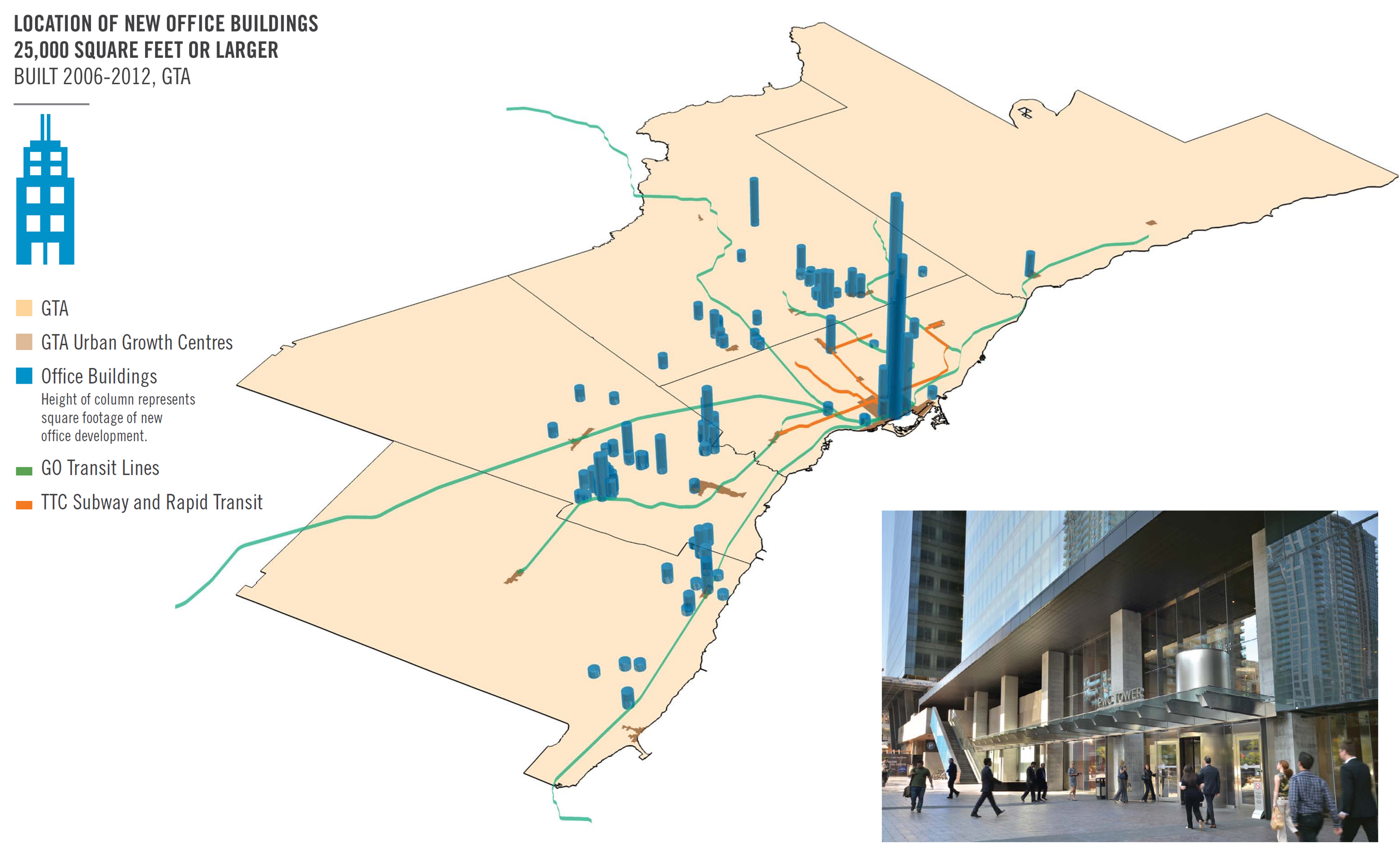
View a larger version of this map (PNG).
GTA refers to the Regions of Halton, Peel, York and Durham and the City of Toronto.
Considerations
The data captures activity in the Greater Toronto Area, not the entire Greater Golden Horseshoe. Some of these buildings would not be considered major office under the Growth Plan’s policies because they are less than 10,000 square metres.